Config Wizard CSS
In order to customize the Configuration Wizard which pops up when End Users are configuring a Solution Instance for their own use, it is possible to upload your own custom CSS in your Partner Account settings.
Overview
In order to customize the Configuration Wizard which pops up when End Users are configuring a Solution Instance for their own use, it is possible to upload your own custom CSS in your Partner Account settings. This will allow you to make sure that Config Wizard screens visible to End Users are in keeping with your branding.
It is recommended that you only make simple styling changes to the Config Wizard. Changing the layout and positioning of items may break the display and may also be subject to being overwritten by product updates. The main purpose of this feature is to allow styling changes to colours, fonts, the shape/roundness of buttons, the thickness of borders etc.
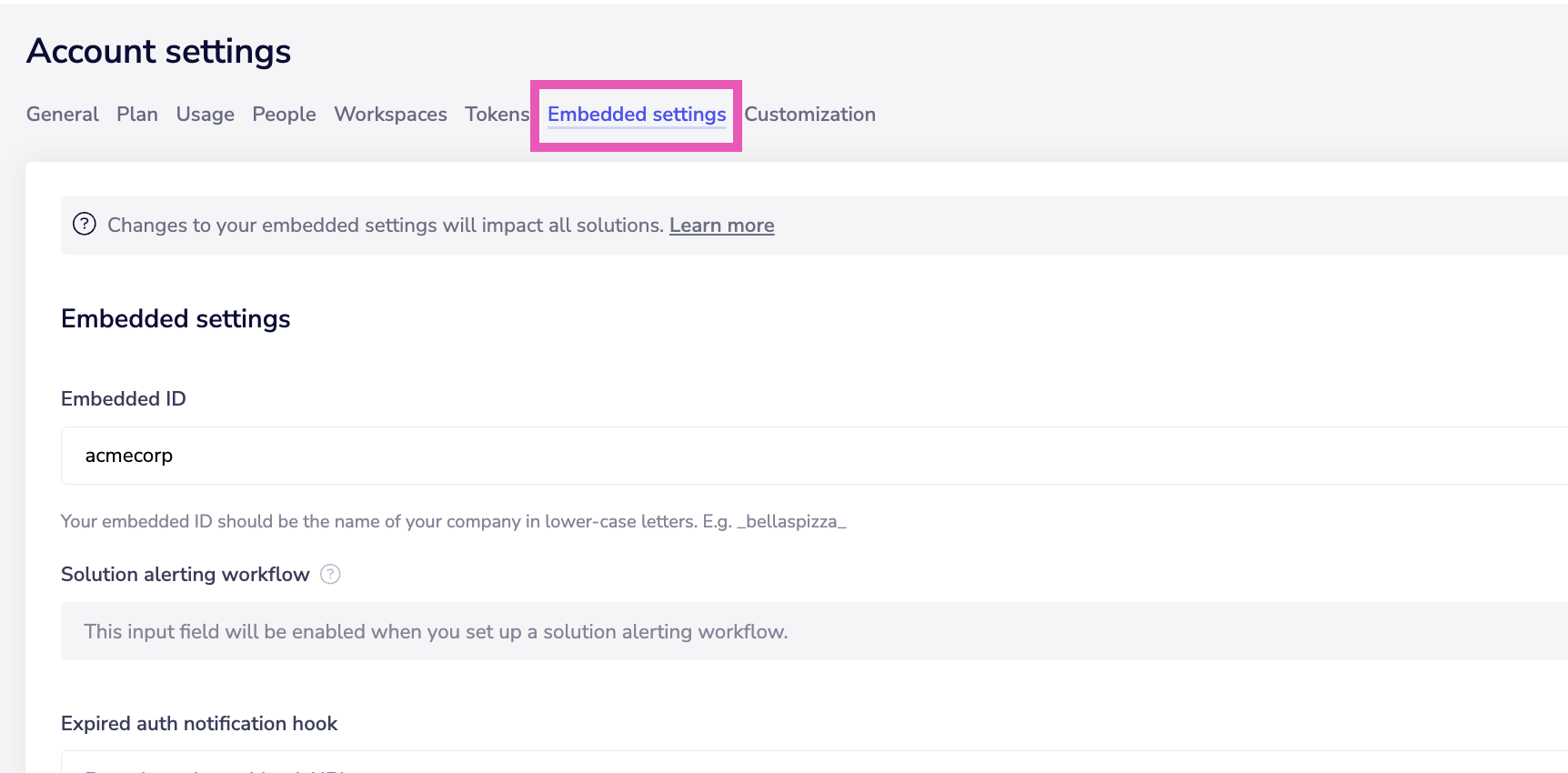
Activate Config Wizard CSS by setting Embedded ID
To activate the feature you first of all need to set an Embedded ID (e.g. the initials of your company) in the Account settings > Embedded settings in your dashboard:
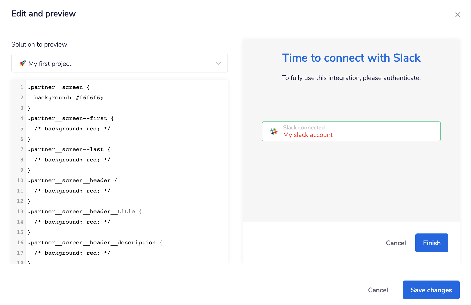
Editing the Config Wizard CSS
To edit the Config Wizard CSS you can go to Account settings > Customization in your dashboard:
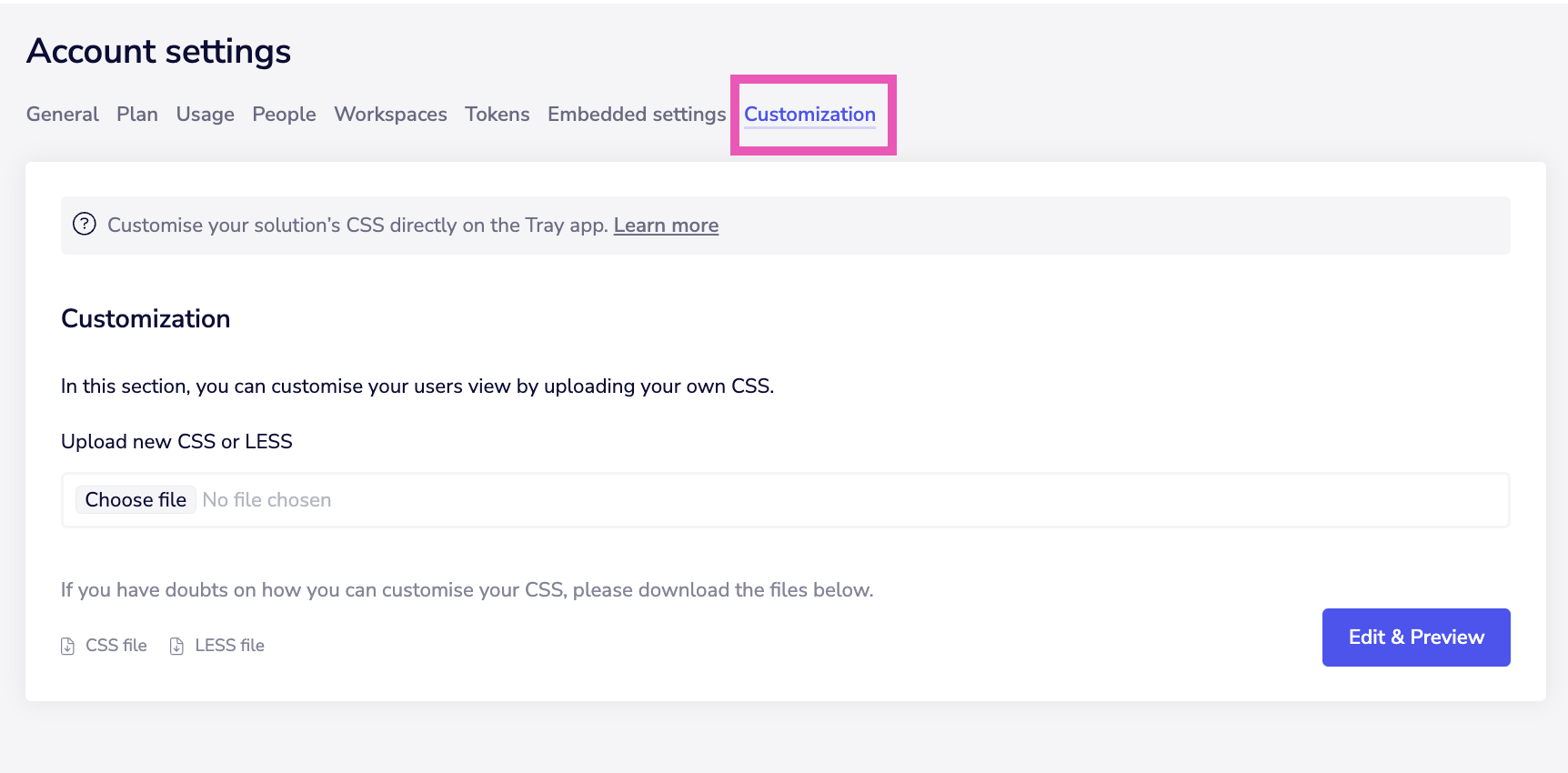 You have a choice of either uploading custom css files (using the 'choose file' button), or using the in-app editor and live preview facility (using the 'Edit & Preview' button).
Downloading the pre-populated CSS/LESS file or using the Edit & Preview function will show you the classes available to work with.
You can work with elements according to the following example:
You have a choice of either uploading custom css files (using the 'choose file' button), or using the in-app editor and live preview facility (using the 'Edit & Preview' button).
Downloading the pre-populated CSS/LESS file or using the Edit & Preview function will show you the classes available to work with.
You can work with elements according to the following example:
partner__itemaffects all items in the UIpartner__item--authspecifically affects all authentication items (e.g. auth drop-down list) So the following rule could be implemented to affect all authentication items.partner__item--auth > div \{ color: red; \} The following screenshot shows the live edit and preview when customizing your CSS:
 Following is the full list of available classes:
partner__screen
partner__screen--first
partner__screen--last
partner__screen__header
partner__screen__header__title
partner__screen__header__description
partner__screen__items
partner__item__title
partner__item--auth
partner__item--config
partner__item--public-url
partner__modal__delete-auth
partner__modal__edit-auth
partner__modal__new-auth
partner__message--error
partner__field__checkbox
partner__field__radio
partner__button--cancel
partner__button--previous
partner__button--finish
partner__button--next
partner__button--add
partner__footer
partner__footer__button-group
partner__footer__step-indicator
partner__footer__step-indicator__dot
partner__footer__step-indicator__dot--active
Using customized fonts
You can use google fonts or self hosted fonts on a CDN to customize typography.
@import url('https://fonts.googleapis.com/css2?family=Phudu&display=swap');
 .partner__screen \{
     font-family: 'Phudu';
\}
Global vs individual solution styling
It is possible to set styling for individual solutions.
This can be done by wrapping styling using #partner__<solution_id> as a wrapper for any individual changes you wish to make.
You can get the solution id for a particular solution from the url when editing that solution, or via the Embedded API get solution query
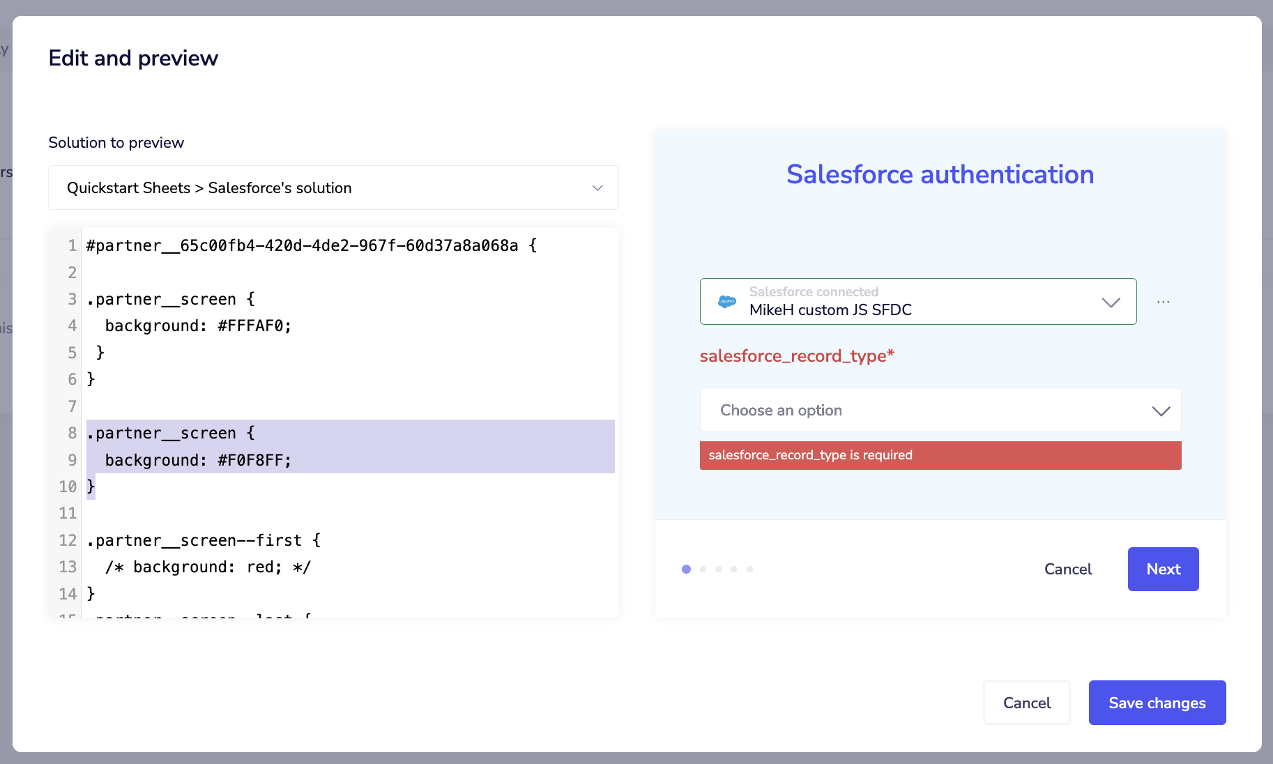
In the following example the main partner__screen background has an individual setting for one solution and a global setting for all others:
#partner__65c00fb4-420d-4de2-967f-60d37a8a068a {
.partner__screen \{
  background: #FFFAF0;
 \}
}
.partner__screen \{
  background: #F0F8FF;
\}
Here we see the preview for a Solution which comes under the global background setting:
Remember that the CSS file is a global file that will be the same for all solutions. Any one solution will only pick up individual styling if there is a wrapper using its solution id.
 And here we see the preview for the Solution affected by the individual wrapper:
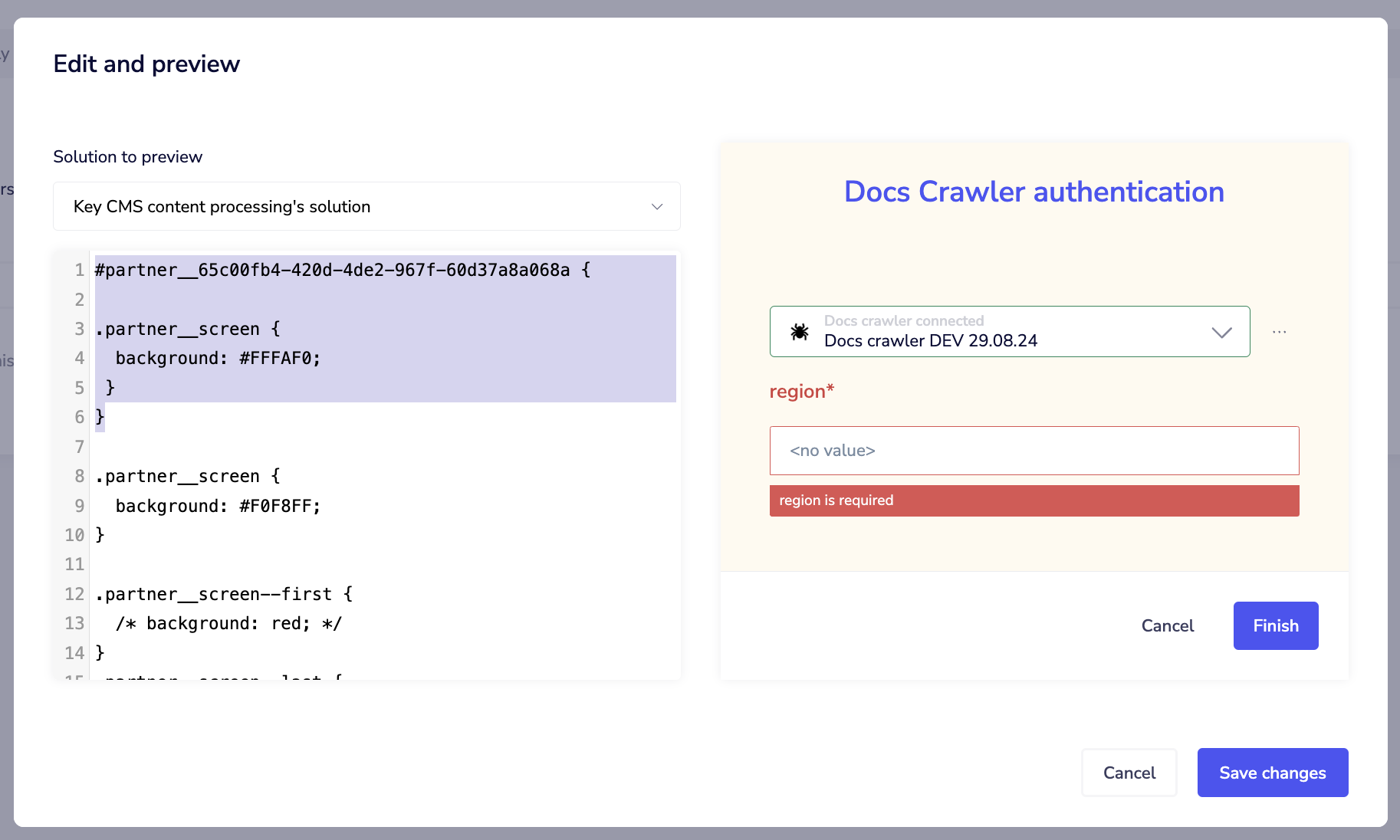 Note that when using the 'Solution to preview' drop-down you can paste the solution id to quickly jump to any of the solutions you have individually customized in order to preview them.
Note on Caching
Note that once you save changes, it can take up to an hour for CSS changes to fully propagate to your applications globally.
Further Notes
Some further notes when editing CSS:
- Avoid using more than 2 levels within a class (for example
.partner__screen div h1 span) - Analysis of the source CSS for the End User Config Wizard will show that there are some Tray-specific classes (such as 'header_123ABC123QWE') for elements in the wizard. These are hashed on deployment so will change regularly. Therefore you should not attempt to use these as customizable classes.
- Some elements may require the use of
!importantto take effect. For example, in order to change the color of the 'Next' button...
.partner__button--next\{
background: green!important;
\}
Auth-only dialog CSS
If you are using the Auth-only dialog (i.e. your integration does not require End Users to carry out any personalization beyond authenticating with services) then it is possible to whitelabel the CSS using Tray's built-in CSS Editor. You can do this with the following steps:
- Set up your auth-only dialog as explained in the Auth-only dialog guide
- You will see that the screen has no CSS styling applied:
- Right-click and choose 'inspect' to bring up the page elements
- Observe the different classes, including 'partner_screen'
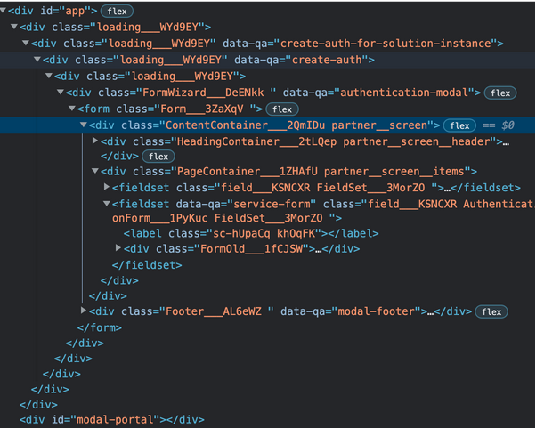
- In the Tray UI, go to settings & people > customization > edit & preview:
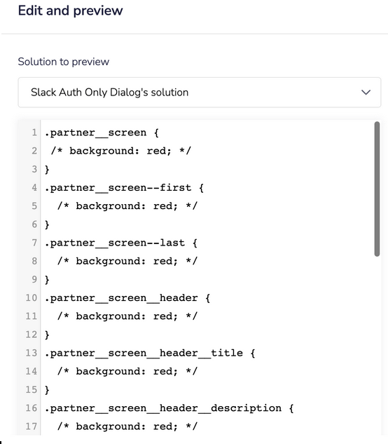 Here you can modify
 .partner_screento be whatever style you want
It is not possible to use the 'preview' function to view changes to auth-only dialog CSS. You will need to apply the changes and then run the dialog in your browser to view them (changes might take a few minutes to take effect, as css is cached).
Making changes to this class will affect it across all your solutions
- After making the CSS changes and re-running the auth-only dialog, you should see your new styling: