
This post is the second in a two-part series about managing workflow alerts. The first covered getting a Slack notification when an error happens. This time, we’ll get a bit more advanced and develop a dashboard for users who need to manage a relatively high volume of workflow tasks.
I don’t know about you, but keeping up with the onslaught of emails, chats, text messages, push notifications, and woofs is a serious battle for me (my SLA for replying to Slack messages is creeping up on 48 hours). When I started at Tray.ai, I started feeling the pain our resident star operations manager knew all too well - alert fatigue!
Like many operations teams, we own several mission-critical processes, and our portfolio is changing and growing daily.
Even though we automate many processes with an AI-ready iPaaS to do more, faster, we also need to monitor the progress of our workflows. In many cases, we use Slack to send ourselves alerts on what’s working, what isn’t, and where issues may occur.
Unfortunately, the repetitive nature of Slack alerts can lead even the most vigilant operations team to lose sight of how often workflows are failing and why sometimes.
Error dashboard to the rescue!
A dashboard helps us understand which workflows are experiencing errors, how often the errors happen, and which parts of the workflows are problematic.
Dashboards help us monitor mission-critical problems in daily operations and prioritize less-critical issues for cleanup at a later date. In this example, we also use our customer data platform Segment as well as our data warehouse Redshift and our analytics platform Sisense, formerly known as Periscope Data.
We can implement our dashboards by extending our original workflow solution using the following:
- A Segment Track operation: To log error events in our alerting workflow
- A Segment warehouse destination: To sync events to our data warehouse
- A data warehouse: To store our error data (read more about how to use Redshift)
- A Sisense dashboard: To create our charts
Don’t have quite the same stack here? Fear not, you can easily tweak the concepts here using the Tray platform for a variety of architectures and solutions, which I’ll do my best to point out along the way!
Our dashboard is quite simple. There’s just two charts and two filters:
- Errors by Workflow: A cohort chart, which has a rollup count of errors by workflow name and error step.
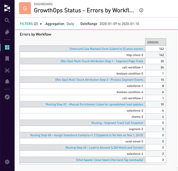
errordash-cohort
**Errors Over Time:**An area timeseries chart which charts error count by workflow over the aggregation type (such as daily, weekly, or monthly) and date range we choose in the filters.
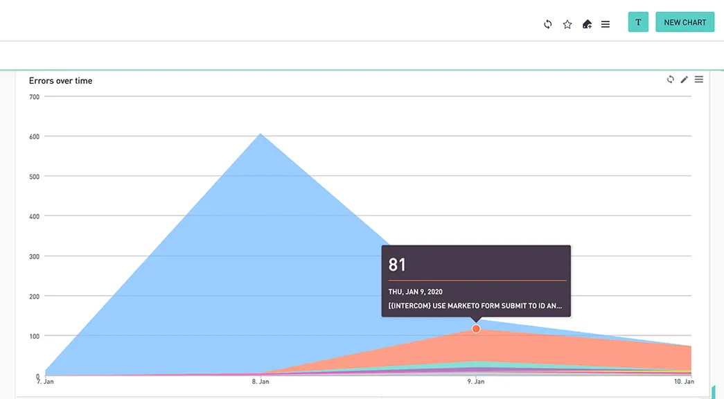
errordash-timeseries
Setting up an Alerting Workflow
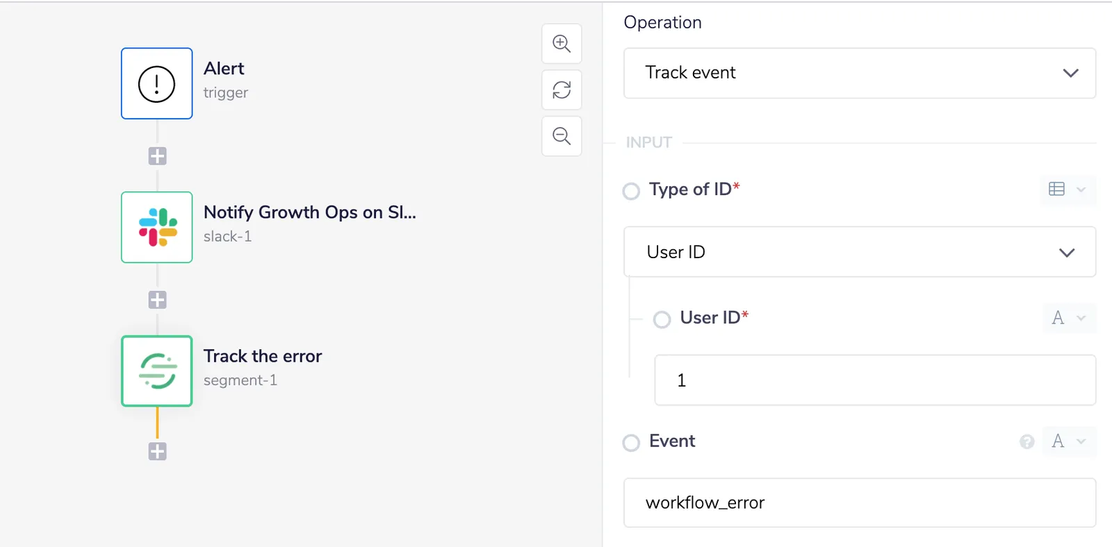
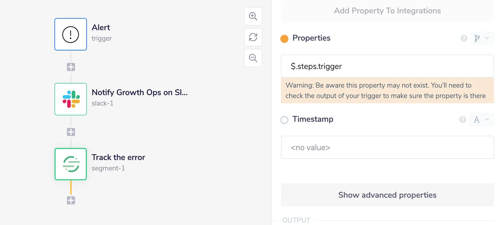
Using the Tray Platform’sSegment connector, we can pass error data to our warehouse by dragging it into our alerting workflow and selecting the “Track Event” operation:
Screen Shot 2020-01-10 at 3.28.37 PM
We can give our event a common-sense name (like “workflowError”) and pass the entire contents of the trigger output object into the properties object of the event using JSON path:
Screen Shot 2020-01-10 at 3.29.42 PM
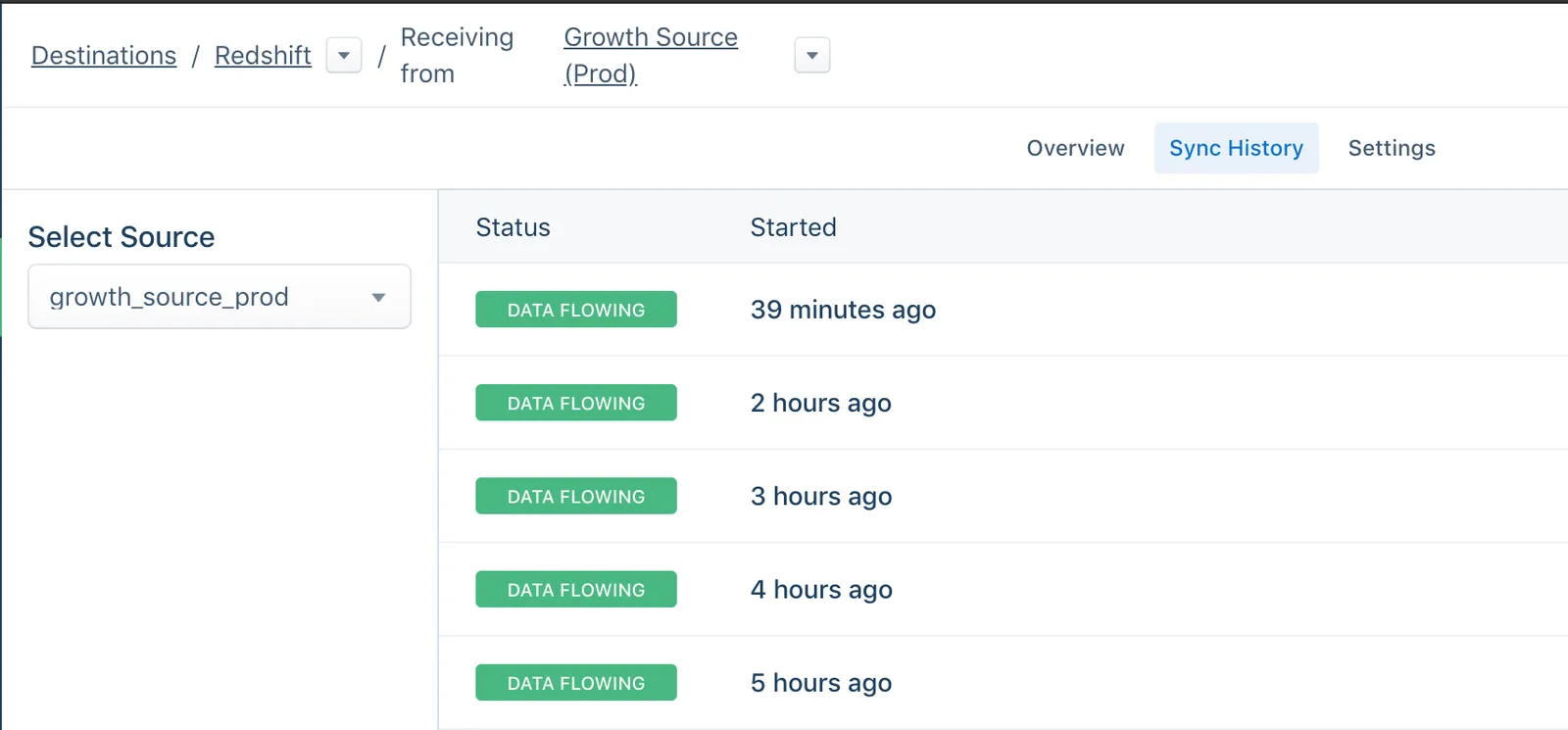
Our team uses a dedicated Segment source for various workflow analytics we track, which in turn syncs to our data warehouse every hour:
Screen Shot 2020-01-10 at 3.31.39 PM
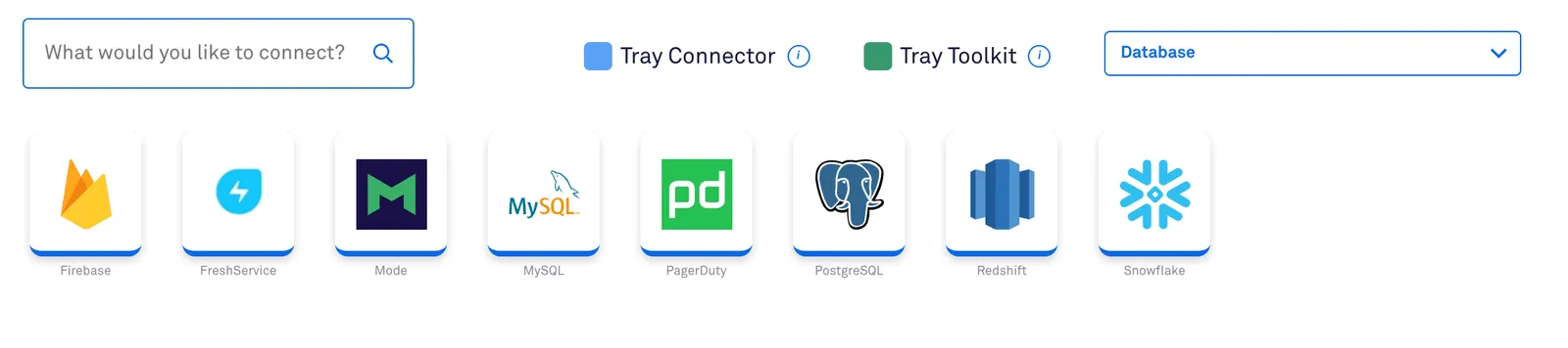
If you don’t use Segment, no problem! Instead, use one of our data warehouse connectors to insert each row directly:
Screen Shot 2020-01-10 at 3.33.01 PM
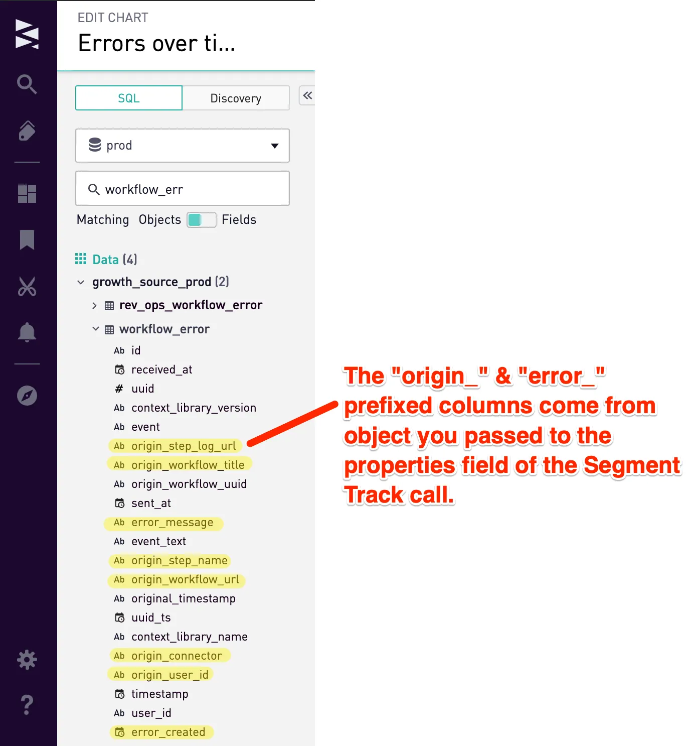
The table schema Segment creates ends up looking like this in our data warehouse:
Pasted Image 1 10 20 7 37 PM
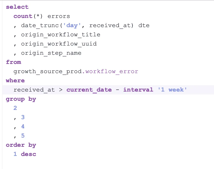
With error data in our data warehouse, we can write a basic query to see what they look like:
Screen Shot 2020-01-10 at 3.39.06 PM
Our query generates a table of errors over the last week ranked by frequency:
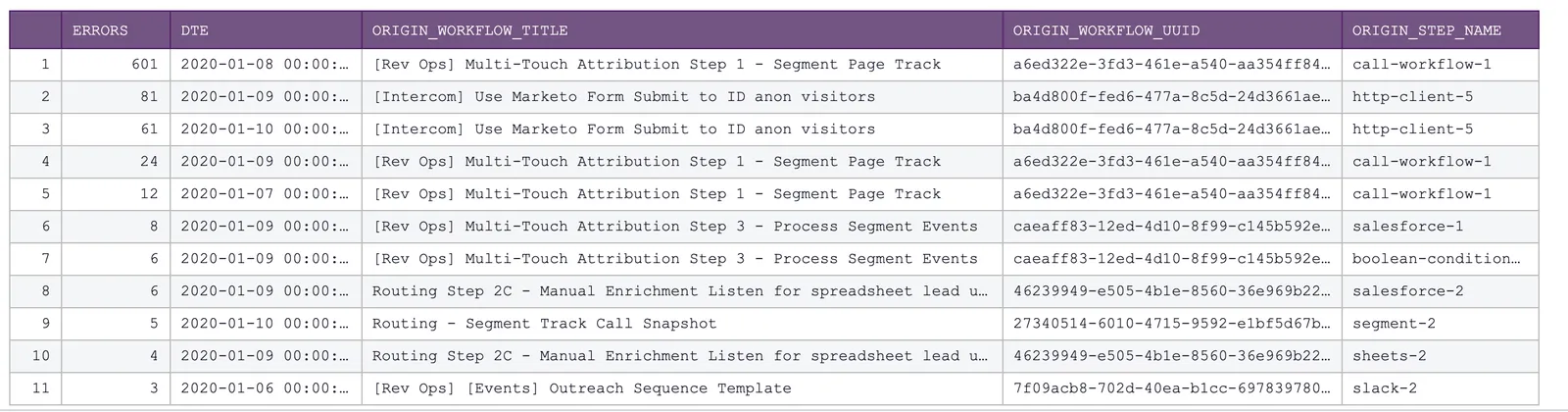
Screen Shot 2020-01-10 at 3.39.47 PM
We’ll need to make a few adjustments to hyperlink our workflow name to its own logs in the cohort chart, as well as to take advantage of the aggregation and date range filters for the timeseries chart:
![Annotated SQL query with callouts explaining the [aggregation] date_trunc placeholder, the workflow title hyperlink syntax concatenating URL and title, and the [received_at=daterange] filter placeholder.](/_astro/362083df8771ed0cca4251e4b1b3628acdc1edc1-1912x972.BDjomGUK_Z1sRQ5q.webp?dpl=dpl_6Ec891QyKUdCPzdFU6guFYPGxSwD)
GrowthOps Status - Errors by Workflow - Sisense for Cloud Data Teams
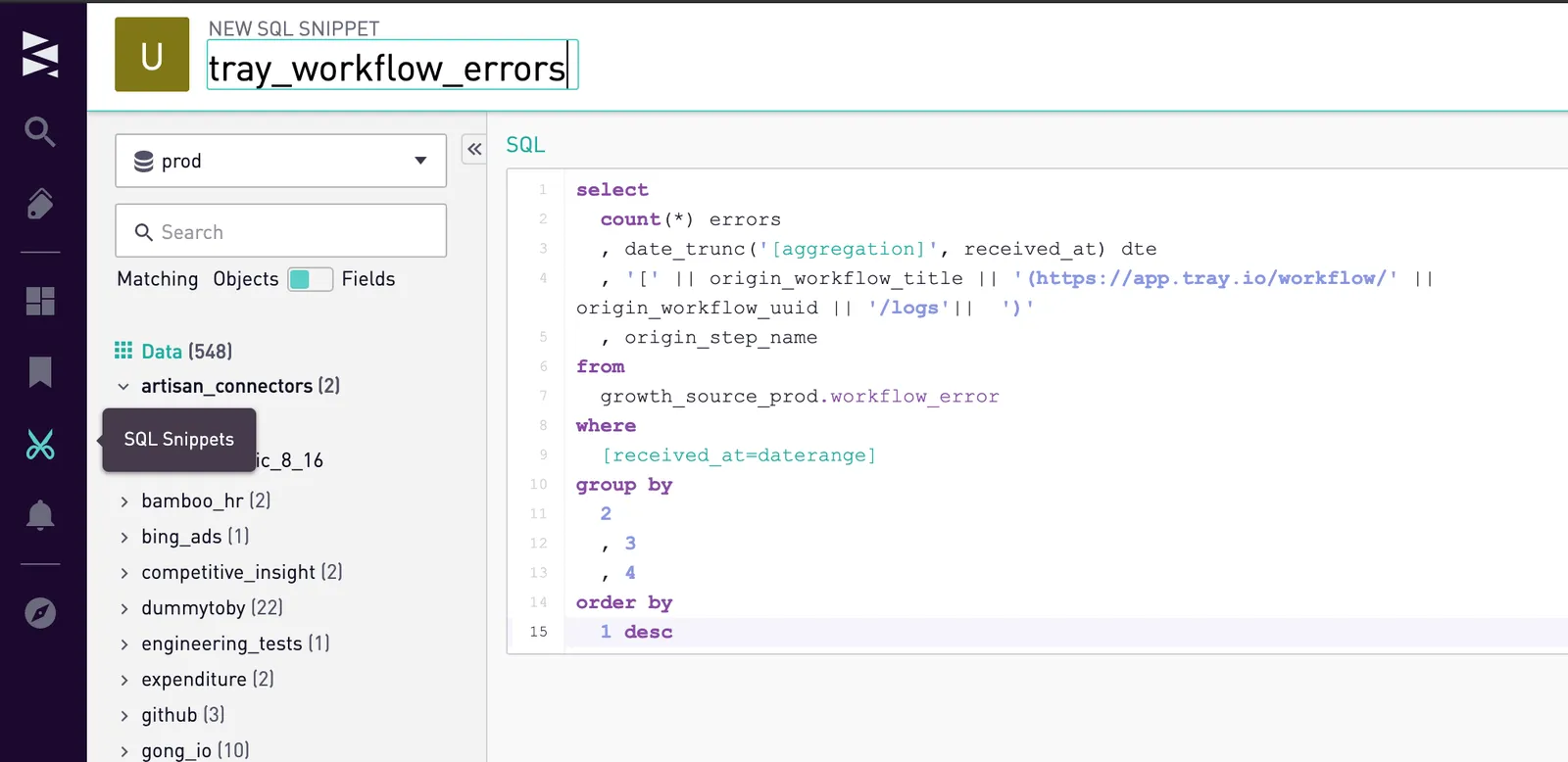
Protip! Leverage SQL snippets so you can write a query once and use it in multiple charts. Save your SQL snippet and give it a name that’s easy to understand and remember:
Screen Shot 2020-01-10 at 3.51.46 PM
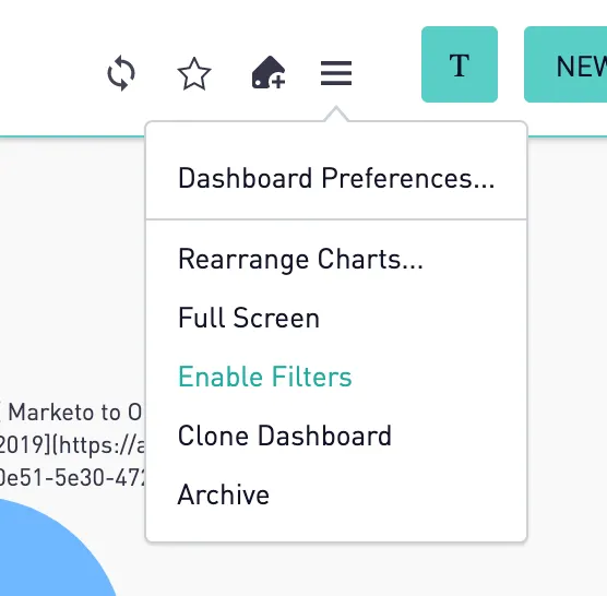
Create a new dashboard in Sisense and “enable filters” in the top-right hamburger menu:
Screen Shot 2020-01-10 at 3.53.00 PM
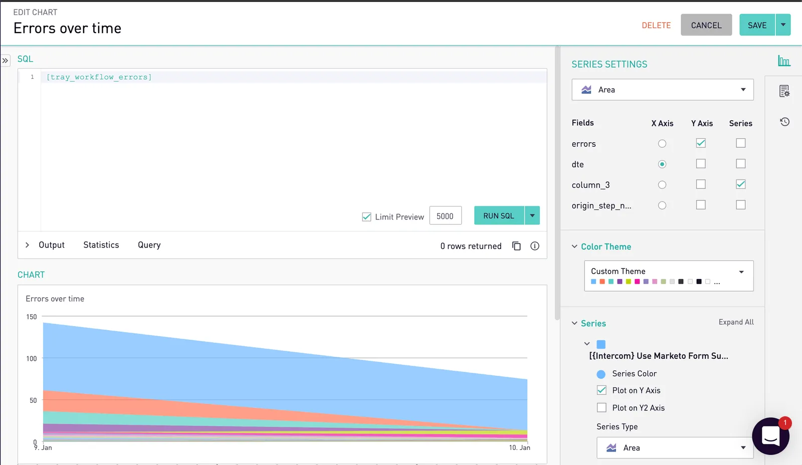
Configure a new cohort chart like this (notice that we call the SQL snippet by wrapping the snippet name in square brackets):
![Sisense Edit Chart view for Errors by Workflow, with the SQL set to the [tray_workflow_errors] snippet and the Cohort Grid series settings on the right.](/_astro/c644835f85bf3971b8abb632f5c5b8a5a77548f7-2244x1488.DaP5TnU7_Z1LvoG2.webp?dpl=dpl_6Ec891QyKUdCPzdFU6guFYPGxSwD)
Screen Shot 2020-01-10 at 3.56.15 PM
As your data syncs via Segment, rather than watching the Slack channel like a hawk, you can now check this chart throughout the day to see if any mission-critical problems pop up that actually need your attention!
What about errors that pile up over time? We’ll need to look at larger timeframes on the cohort chart. We can use a trendline chart using the same query:
Screen Shot 2020-01-10 at 4.02.44 PM
Because the Tray Platform is so flexible, you can easily tweak your alerting workflows and architecture as you think of other interesting ways to fine-tune your alerting processes. For example, we can take advantage of Sisense’s SQL alerts or passing error data to something like Datadog, New Relic, or PagerDuty.
You’re now a lean, mean, alerting machine. Let’s get to work, my friends! A little time upfront will save hours of headaches down the line!
I hope you found this post helpful - if you’re a customer, feel free to reach out to me in our customer Slack channel if you have questions (your CSM can grant you access). Alternately, if you’d like to see more of the Tray olatform in action, watch a quick demo.